# Image Frame
URL: /components/image-frame
Source: https://github.com/daangn/seed-design/blob/dev/docs/content/components/image-frame.mdx
사용자가 업로드한 이미지를 표시하기 위한 컴포넌트입니다.
## Anatomy
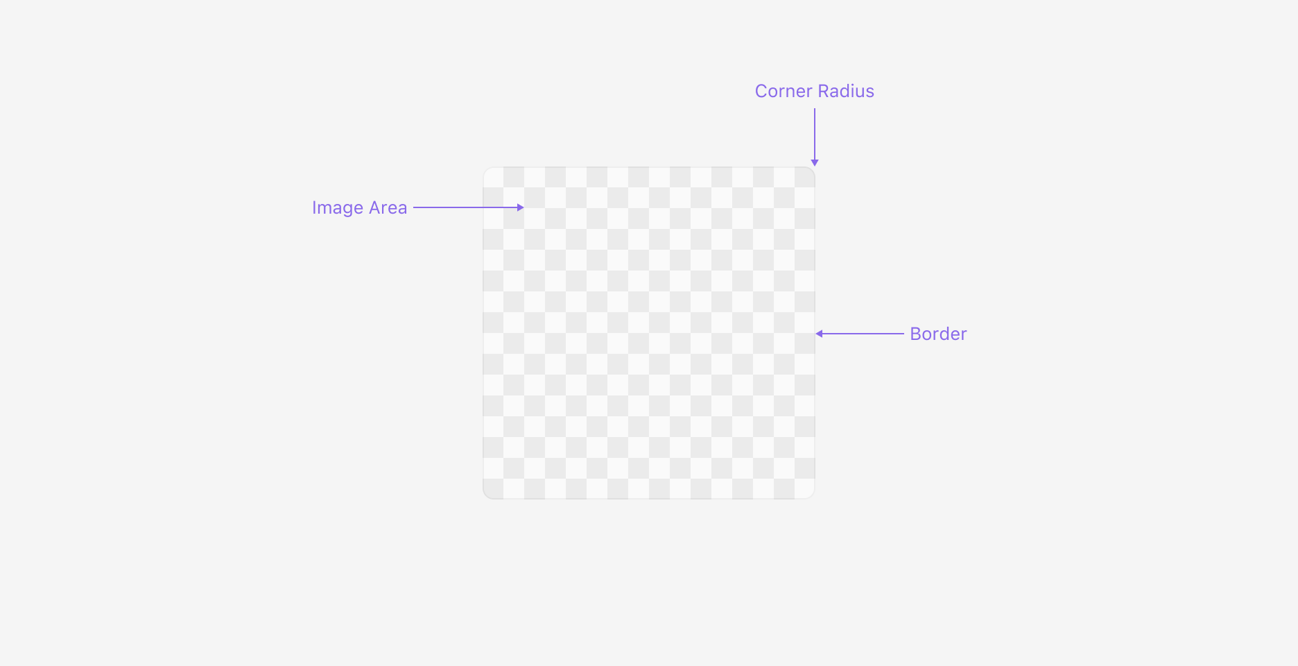
Image Frame은 이미지를 표시하는 Image Area, Corner Radius, Border로 구성되어 있습니다.
## Properties
### Ratio
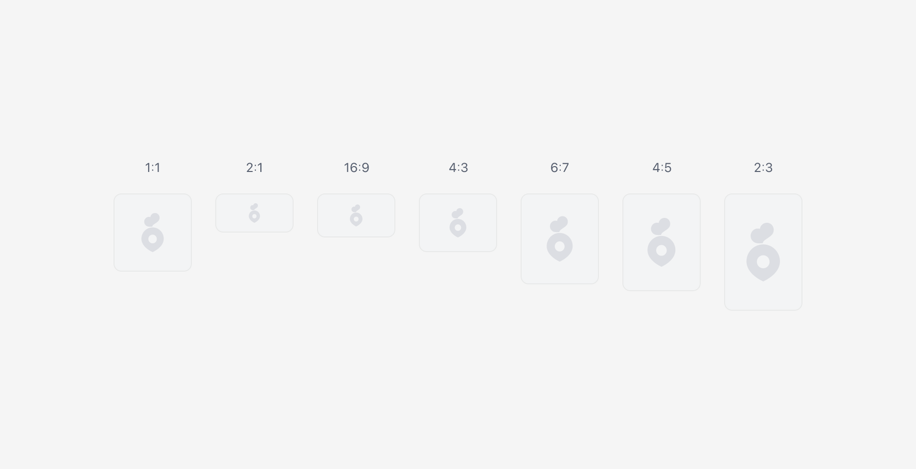
Ratio 속성으로 이미지 사이즈에 상관없이 고정된 비율로 표시할 수 있습니다.
### Size
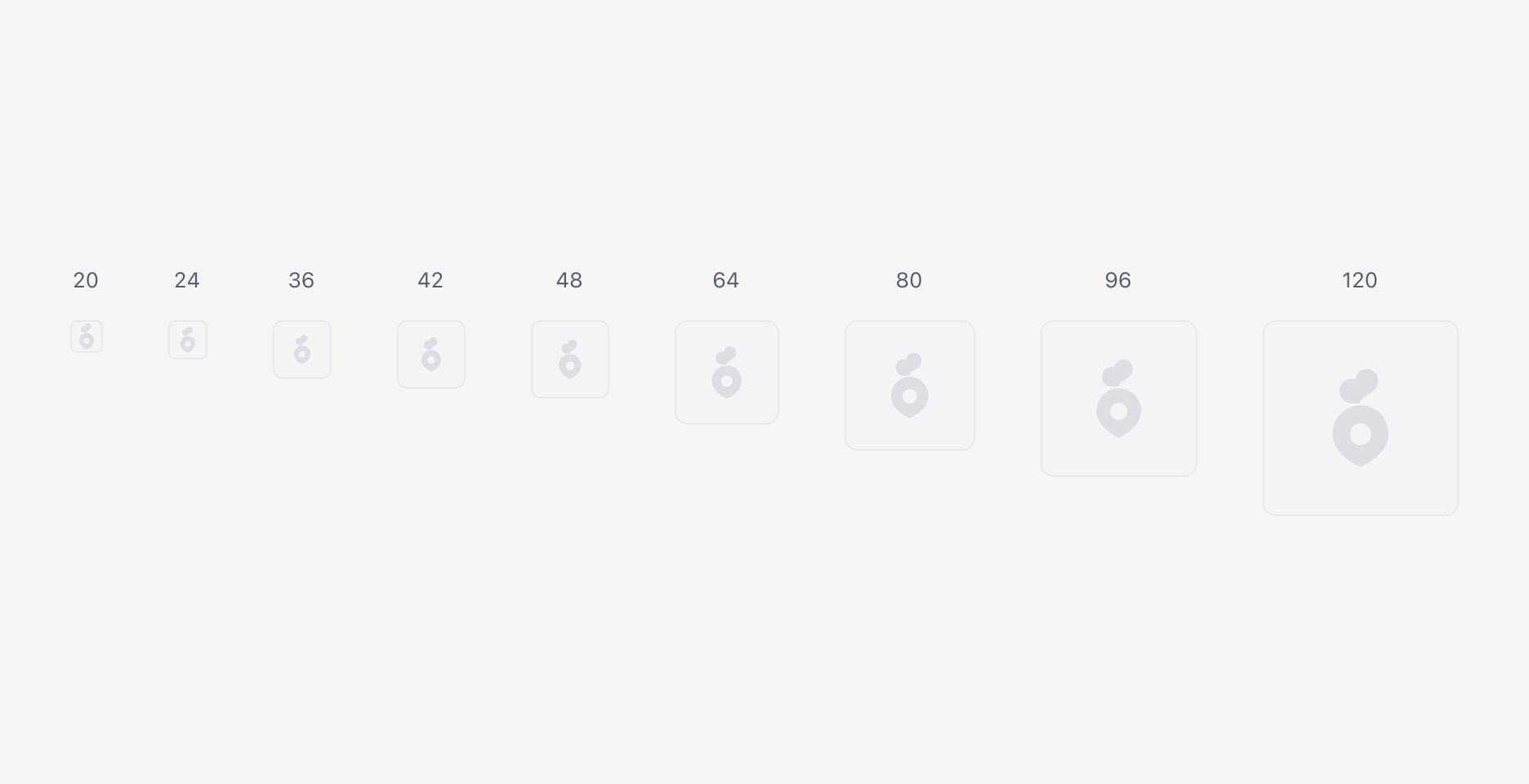
1:1 비율에서 Size 속성을 제공합니다. 이는 구현 상의 스펙은 아니며, 권장하는 사이즈 가이드에 가깝습니다. 이외의 사이즈를 사용하는 경우 Free 사이즈를 선택하여 사용해주세요.
### Fallback Image
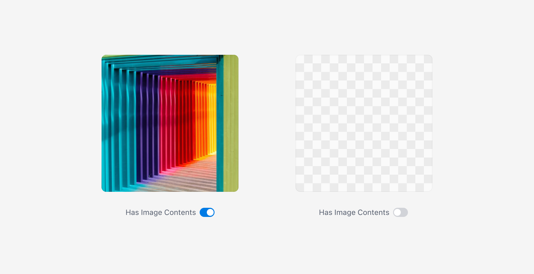
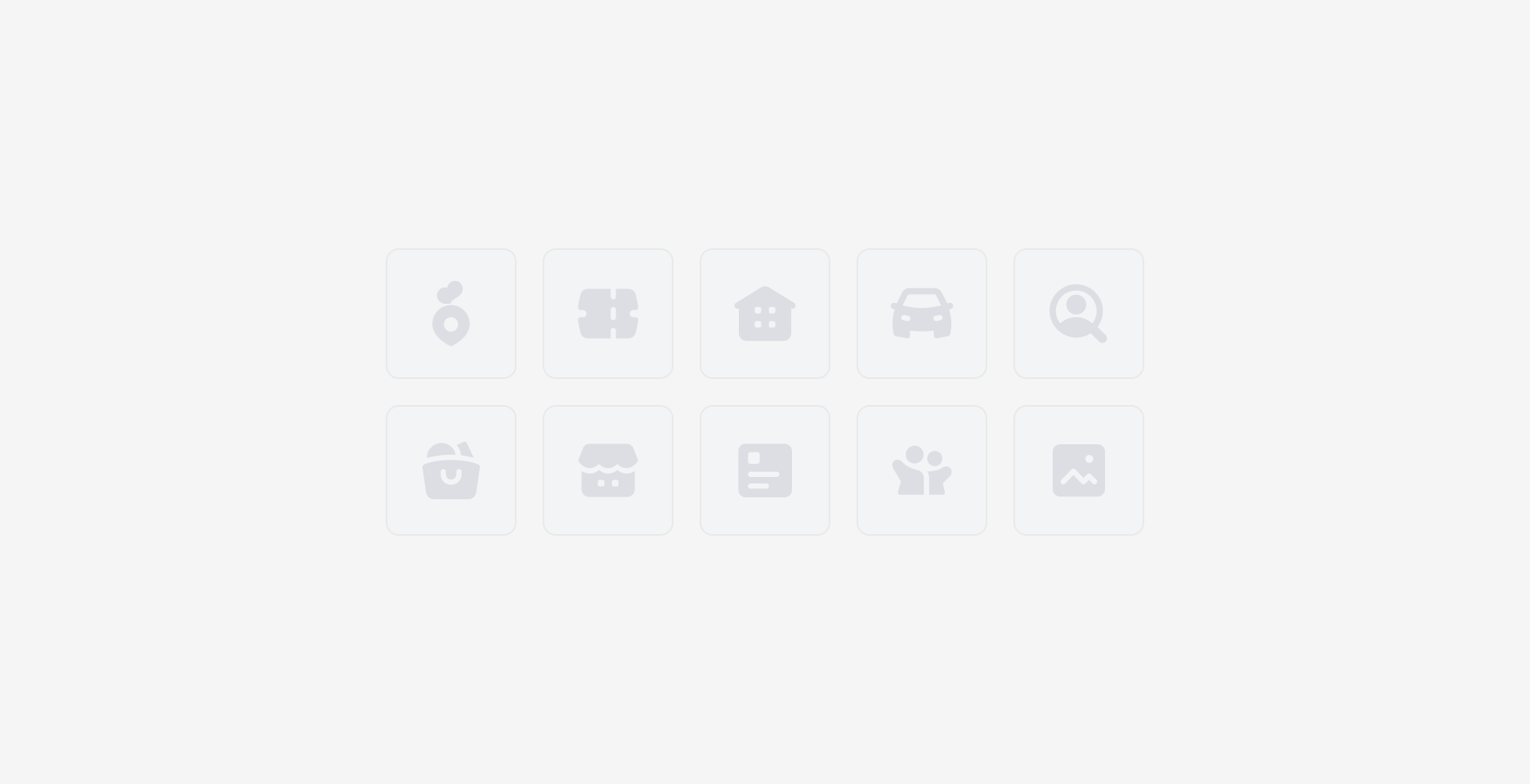
이미지 컨텐츠를 표시할 수 없는 경우 Fallback 이미지가 표시됩니다. Fallback 이미지는 [Content Placeholder](/components/content-placeholder)를 사용하여 사용처에 따라 다르게 표시할 수 있습니다.
### Border Radius
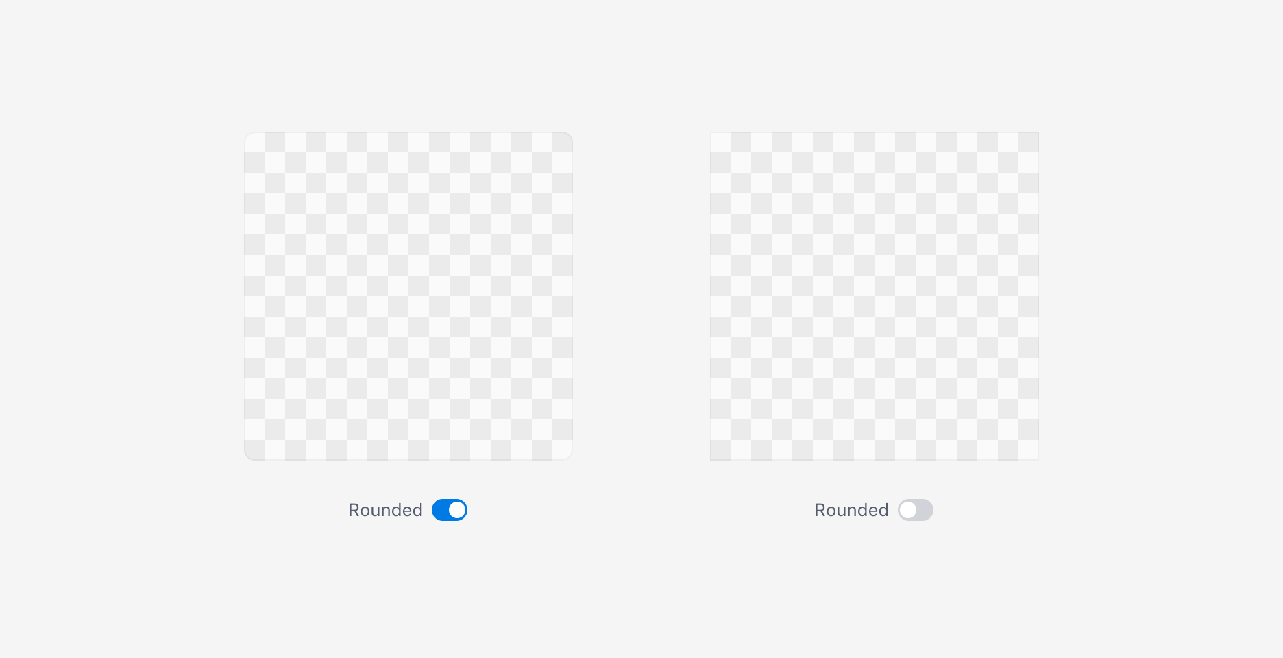
Border Radius 옵션으로 모서리를 둥글게 처리할 수 있습니다.
### Show Overlay
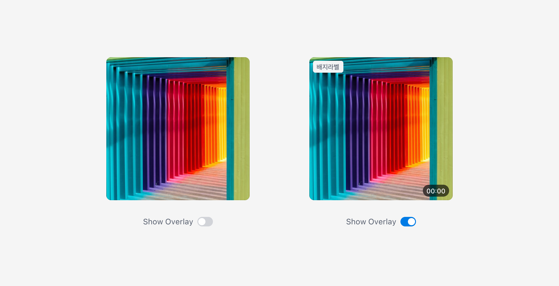
Show Overlay 옵션을 사용하면 이미지 위에 보조 UI 요소(Overlay Element)를 표시할 수 있습니다.
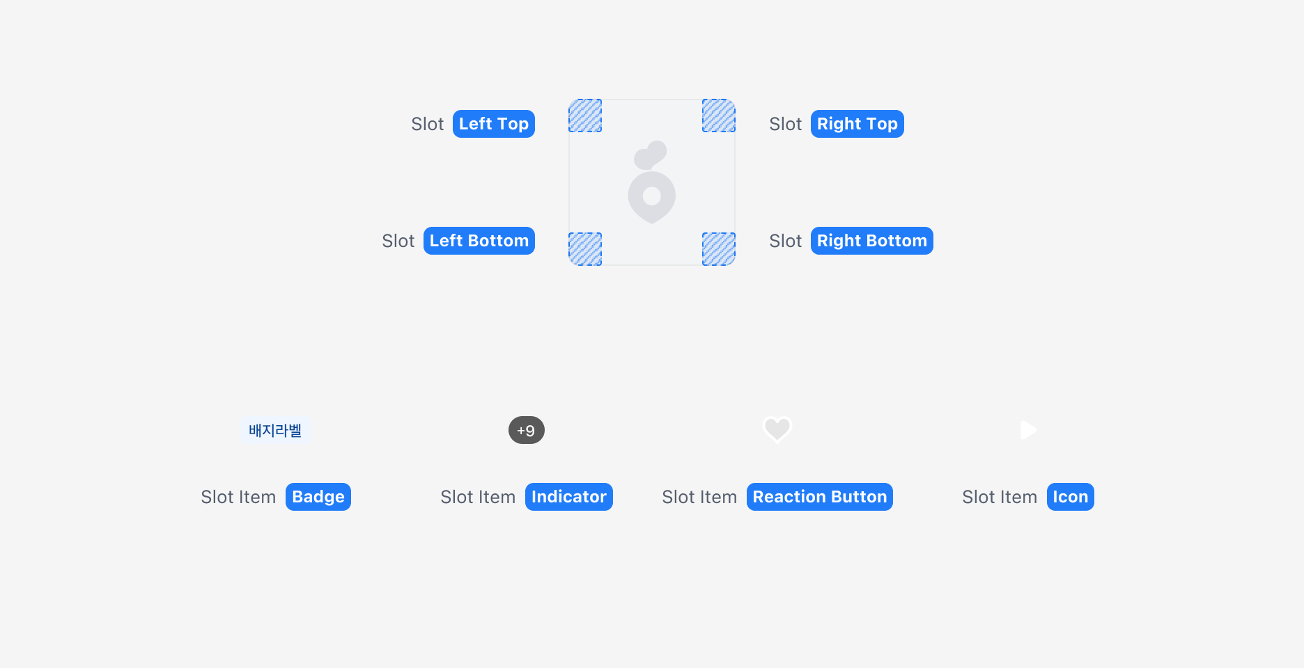
Overlay 요소는 네 모서리를 기준으로 Slot에 배치되며, 각 Slot에는 하나의 요소만 표시됩니다.
Slot에 표시할 수 있는 요소는 다음과 같으며, Custom Slot을 통해 추가 요소도 사용할 수 있습니다.
| 요소 | 용도 |
| -------------------------- | ---------------------------- |
| [Badge](/components/badge) | 상태, 분류, 강조할 라벨 표시 |
| Indicator | 이미지 개수, 영상 길이 등 콘텐츠 메타 정보 전달 |
| Reaction Button | 사용자 상호작용 유도 (관심 버튼 등) |
| Icon | 콘텐츠 타입 표시 (재생 아이콘 등) |
## Guidelines
### Corner Radius 적용
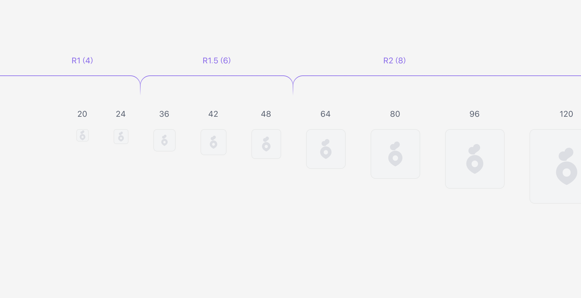
Rounded 속성 활성화 시 Corner Radius는 [`$radius.r2`](/foundations/design-token/reference/%24radius.r2)(8px)로 설정됩니다. 이미지의 가로 크기가 48 이하인 경우에는 Corner Radius 값을 적절히 조정하는 것을 권장합니다.
Radius 토큰을 확인합니다.
### Rounded 속성의 사용
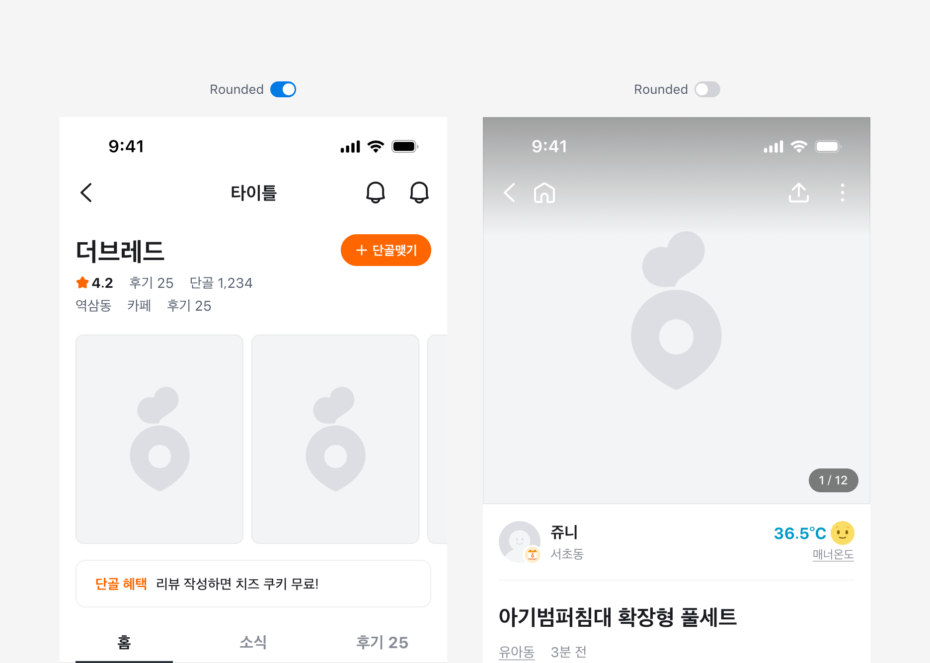
이미지가 화면 가로 크기에 맞춰 꽉 차게 표시되는 경우에는 Rounded 옵션을 비활성화합니다.
### State
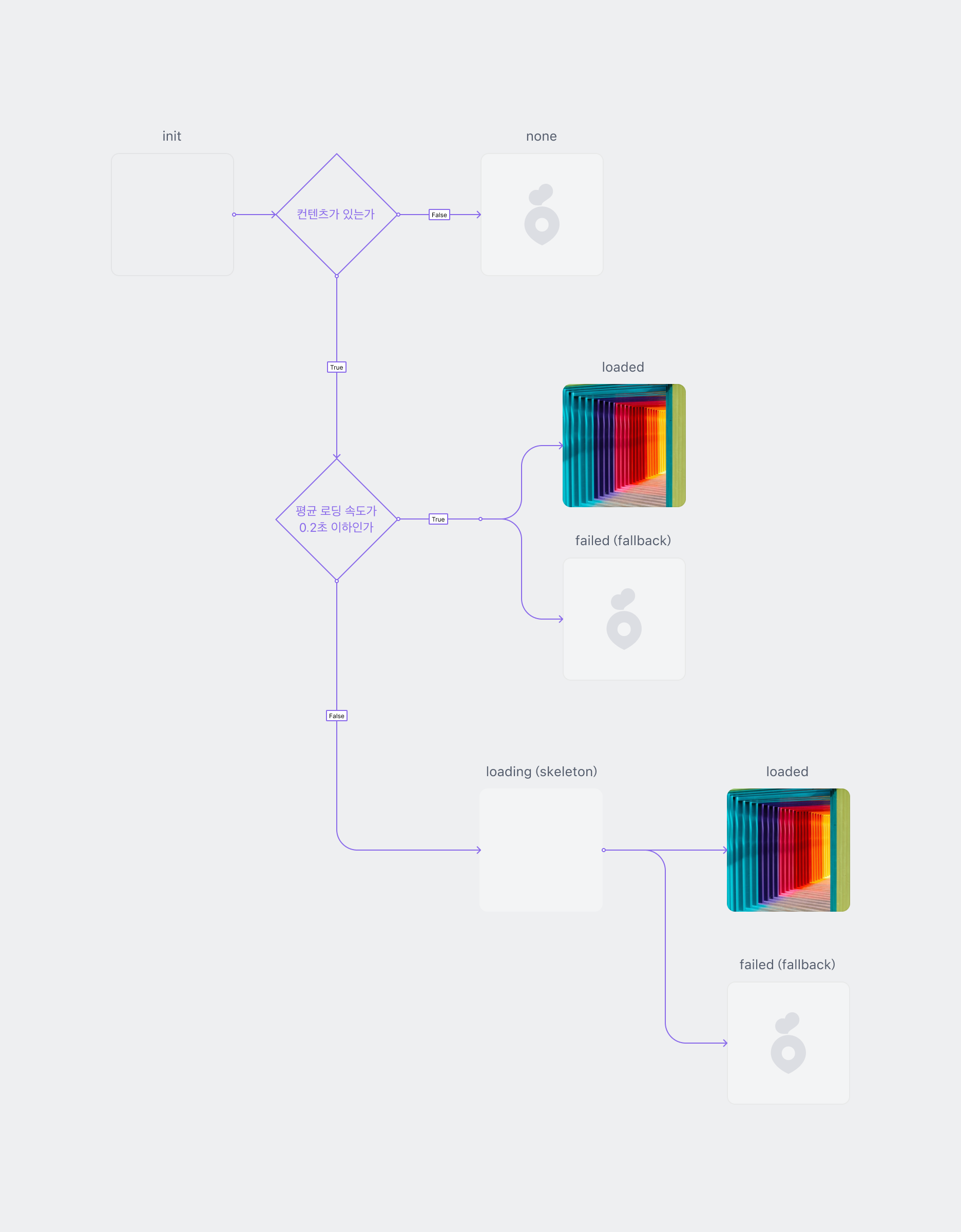
이미지는 초기화(init), 로딩 중(loading), 로드 완료(loaded), 실패(failed) 상태를 가집니다.
이미지 파일이 큰 경우, 평균 로딩 시간이 0.2초 이상이면 로딩 상태를 표시하는 것을 권장합니다. 반면 0.2초 미만이면 로딩 상태 표시가 깜빡임을 유발하여 시각적 불편함을 초래할 수 있습니다.
로딩 표시는 기본적으로 [Skeleton](/components/skeleton) 방식을 제공하며, 필요에 따라 블러(blur), 단색(mono color) 등 다양한 방식을 선택할 수 있습니다.
### 이미지 위에 Overlay 요소 표시하기
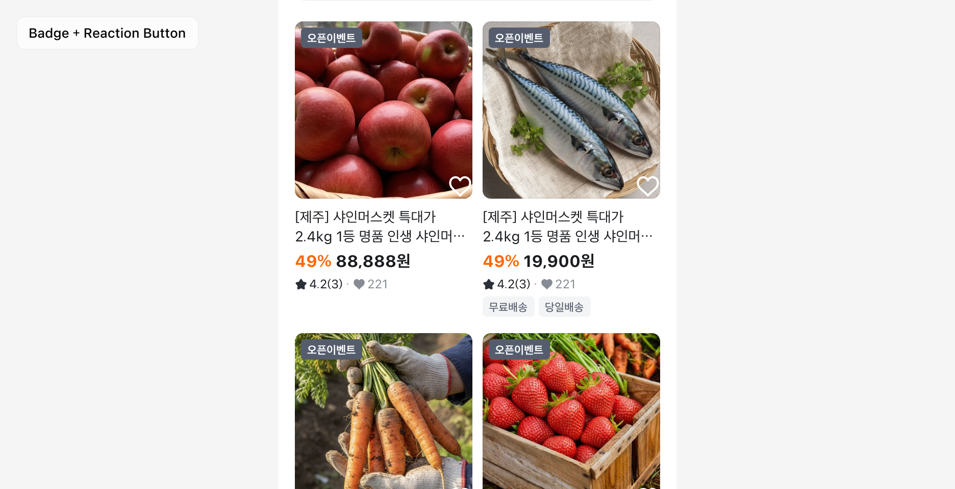
이미지 위에 보조 UI 요소인 Overlay Element를 표시할 수 있습니다. Overlay 요소는 네 모서리의 Slot에 배치되며, 각 Slot당 하나의 요소만 배치 가능합니다. Overlay는 가독성을 우선하며 주 콘텐츠를 가리지 않습니다. Overlay Element는 최대 2개를 권장하고, 표시되는 요소에 따라 위치를 조정할 수 있습니다.
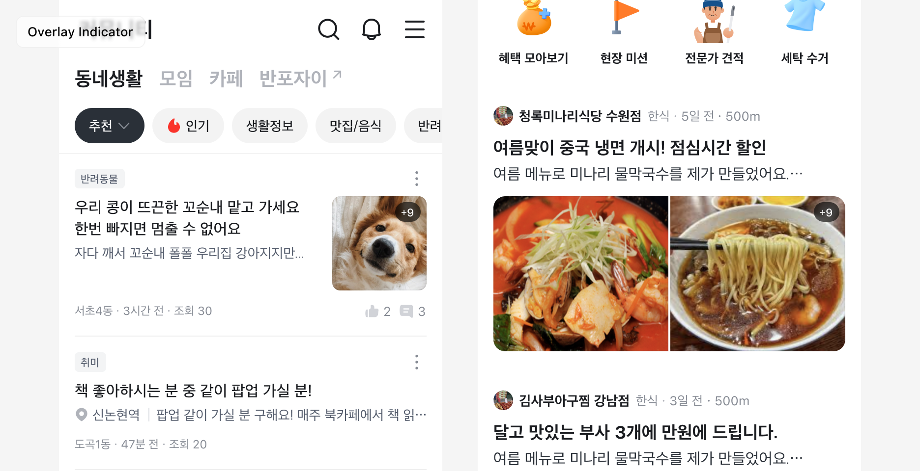
\*\*[Badge](/components/badge)\*\*는 상태나 분류를 표현할 때만 사용하며, 시간·개수·길이 같은 메타 정보에는 사용하지 않습니다. Indicator는 사용자가 콘텐츠를 보기 전에 알면 좋은 설명적 정보를 보여줄 때만 사용하며, 상태 표시나 강조 용도로 쓰지 않습니다.
**Reaction Button**은 명확한 사용자 액션이 있을 때만 사용하며, 별도의 터치 영역을 가집니다. Icon은 콘텐츠 타입을 표시하는 용도로만 사용하며, 액션을 가지지 않습니다.
## Specification
### Image Frame
Component spec (JSON): /rootage/components/image-frame.json
### Content Placeholder
Component spec (JSON): /rootage/components/content-placeholder.json
### Image Frame Floater
Component spec (JSON): /rootage/components/image-frame-floater.json
### Image Frame Indicator
Component spec (JSON): /rootage/components/image-frame-indicator.json
### Image Frame Reaction Button
Component spec (JSON): /rootage/components/image-frame-reaction-button.json